0.5.1 - Updated UI
Ahoi there, mateys!
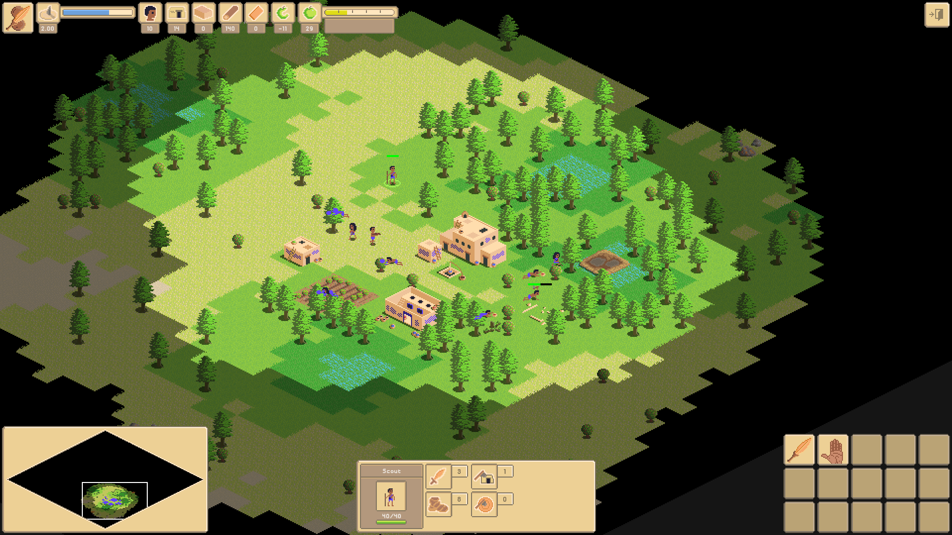
We finally found time to work on a new update. This round our main focus has been to sort out an issue with the UI for lower screen resolutions. The 'programmer's art' slash prototype-ish UI was mainly designed for 1920x1080, and scaled badly especially for smaller resolutions. An UI update was therefore long overdue.

Expect every single button, label, box, panel, field, you name it, to have been updated with new assets. The only assets we haven't touched are icons and the menu background (but this also scales correctly on all resolutions now).
What about team games?
We know that some of you are waiting for team games, and we haven't forgotten about it. Now that the UI scaling issue is done and dusted, we'll start working on team games next. There's an upcoming social event that we would like to have team games ready for, so we have an internal deadline for this feature.
An extra thank you to the community!
We'd like to show some extra appreciation for our community. Some of you have been following us for over a year, and the support and feedback we've received from you has been really, really great. Game development is a grind and a marathon. So far our community has helped us get through 30 months of development. Thank you!
Change log
General improvements
- Improved 'How to Play' pages
- If the last unit selected enters a Watchtower to garrison it, then the Watchtower will be automatically selected
UI
- Redesigned and changed every single box, button, label etc. in the game
- UI is re-designed to look good for resolutions below full HD as well (like 1364x768)
- UI now scales correctly across all resolutions
- Improved indicators for when you don't have enough resources to construct buildings and train units
- Moved idle villagers button to mini map
- Added showing number of selected units indicator
- Made it more clear what's currently being researched whilst looking at technology tree
- Improved multiplayer connection screen layout
- Background image in main menus now scale correctly pixel perfect across all resolutions
- Correct scaling of pause screen
- Correct scaling of tiles food output indicator
- Added tooltip for current production
- Easier to hit tooltips for stat buttons
Balance changes
- Start with 80 food on EASY difficulty setting (up from 30)
- Start with 35 food on other difficulty levels (up from 30)
- Slinger can no longer fire against a watch tower that is garrisoned by a bowman, without bowman being able to fire back
Bug fixes
- Changing sound volume in settings now changes sound volume for all sound effects
- Mini map now works correctly for all resolutions (moving camera and moving units through the mini map used to only work properly on 1920x1080)
- All garrisoning units are always visible when watchtower is visible
- No longer resetting bottom UI whenever a friendly unit enters a watchtower to garrison it
- Fixed error that would happen when AI tried to produce a unit after all its military production buildings were destroyed
- Fixed error that would happen if clicking to attack a unit just before it entered a watchtower
- Fixed an error that could happen when attemtping to show showing attack indicator
Files
Get The Fertile Crescent
The Fertile Crescent
Captivating reimagining of classic base-building RTS set in the Bronze Age.
| Status | Released |
| Author | LincRead |
| Genre | Strategy |
| Tags | 2D, ancient, bronze-age, Isometric, Multiplayer, Pixel Art, Real time strategy, Unity |
| Languages | English |
More posts
- TFC is exiting Early Access into 1.0 on SteamJun 04, 2024
- TFC: The Fertile Crescent is EA on Steam!Mar 30, 2022
- Game Trailer!Dec 08, 2021
- Steam Multiplayer Demo and Tournament!Nov 16, 2021
- 0.6.8.5 - Video Development Blog, Balance and Bug fixesNov 08, 2021
- 0.6.8.4d - Minor maintenanceOct 10, 2021
- 0.6.8.4b - Minor maintenanceSep 30, 2021
- Steam page announcement (with link!)Sep 21, 2021
- 0.6.8.4 - Reworked wall and watchtowerSep 13, 2021
- The future of TFC: The Fertile CrescentAug 30, 2021

Leave a comment
Log in with itch.io to leave a comment.